Why the Lack of original photography in B2B SaSS?
February 2nd, 2018 by Ariana Shannon

It’s no secret there is a lack of original photography in the B2B SaSS industry. There isn’t a physical product or even a set office location to shoot from most of the time. This leaves design / marketing teams with two options for images: in app screenshots and stock photography.
If you have a well designed UI, screenshots can be beneficial when explaining a user experience to a potential customer. However, it can also work against you.
If a prospect thinks your solution is too complicated for their team to adopt / understand in a short time, then they won’t ask you for a demo because “they already know you.” This reason alone is why some companies choose not to use screenshots on their homepage. They want prospects to ask what does it look like and how it works. By doing so, they can control a prospects’ first impression by leading the conversation around their UI.
Or, if you’re an in-app integration you’re at the mercy of the parent app’s aesthetic. Salesforce is a great example. They’re making improvements with Lightning, but it’s still not the most user friendly app. So if your software has a direct integration with Salesforce, then you’re limited in the way you design your app. Thus, why most direct integration SaSS companies choose stock photography over screenshots.
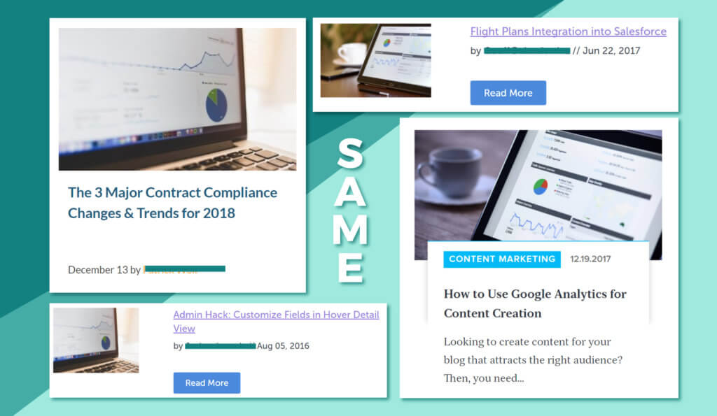
Stock photography allows SaSS companies to integrate a human element to their branding, but it’s not without its drawbacks either. The biggest issue is that the majority of SaSS companies are pulling images from the same photo libraries. ShutterStock, StoryBox, Pexel and Creative Commons to name a few. So you end up with different companies with the same stock photo.

To the design and marketing team’s credit, it’s difficult to find the perfect image you’re looking for when you’re at the mercy of a search engine bar. Especially, when trying to illustrate abstract concepts like increased outreach, work productivity, sales automation or (my personal favorite) anything involving a phone. You find the best one you can and move on.
More established companies with the marketing budgets to create their own stock photography are in luck, but do a lot of them create their own images? No! Why? Well it takes a lot of effort: setting the location, finding models, hiring a photographer and numerous rounds of edits to get good quality photos. Time and money that could be spent on generating new leads.
SaSS companies will always put a higher precedents on obtaining net new leads because that’s what drives business. Since the end consumer is more concerned with pricing and app performance, the lack of original photography will almost always be marked as low priority.
What many SaSS companies don’t know is that there are easy ways to avoid having the same image as your competitor.
- Don’t default to the most popular, free stock photography library. Free is always acceptable in the marketing budget, but you’ll end up with the same hero image as someone else. There are dozens of reasonable stock photography subscription services that have high quality images and illustrations. Take a little time to do research into the top three in your price point and see which library has the most relevant images to your company.
- Go with a more graphic approach. Custom illustrations and typography (text) heavy designs are the rising trends in 2018. If you do decide illustrations might work better for your marketing, then you don’t have to go all out right away with five different characters all with their own names and backdrops.
All you need are a few well placed graphics. It could even be the same character doing different things. Granted, illustrations can a bigger ask than a free stock photo, but illustrations clearly separate you from the traditional SaSS aesthetic.
Putting in a little bit of effort to stand out from the pack may not seem like a big game changer, but it’s something customers will pick up on, and will help you win out against your competitors.
